Apple Explains the Unusual Placement of the Mac Mini's Power Button
- Apple moved the Mac Mini's power button to the bottom—wait, what?
- The tiny Mac Mini has a secret underneath; Apple's execs explain.
- Curious about the Mac Mini's awkward power button? So were we.
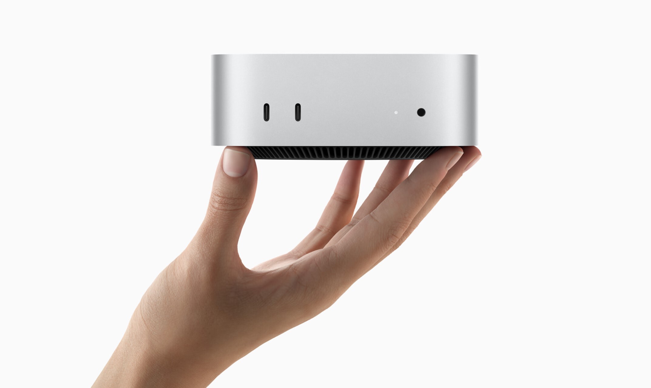
Apple's new M4-powered Mac mini has been turning heads with its impressive performance and remarkably compact design. However, one aspect has left many users scratching their heads: Why is the power button located on the underside of the device? Photo via Apple // Apple's new M4 Mac mini, announced in late October 2024, has Apple fans scratching their heads for its unusual power button placement.
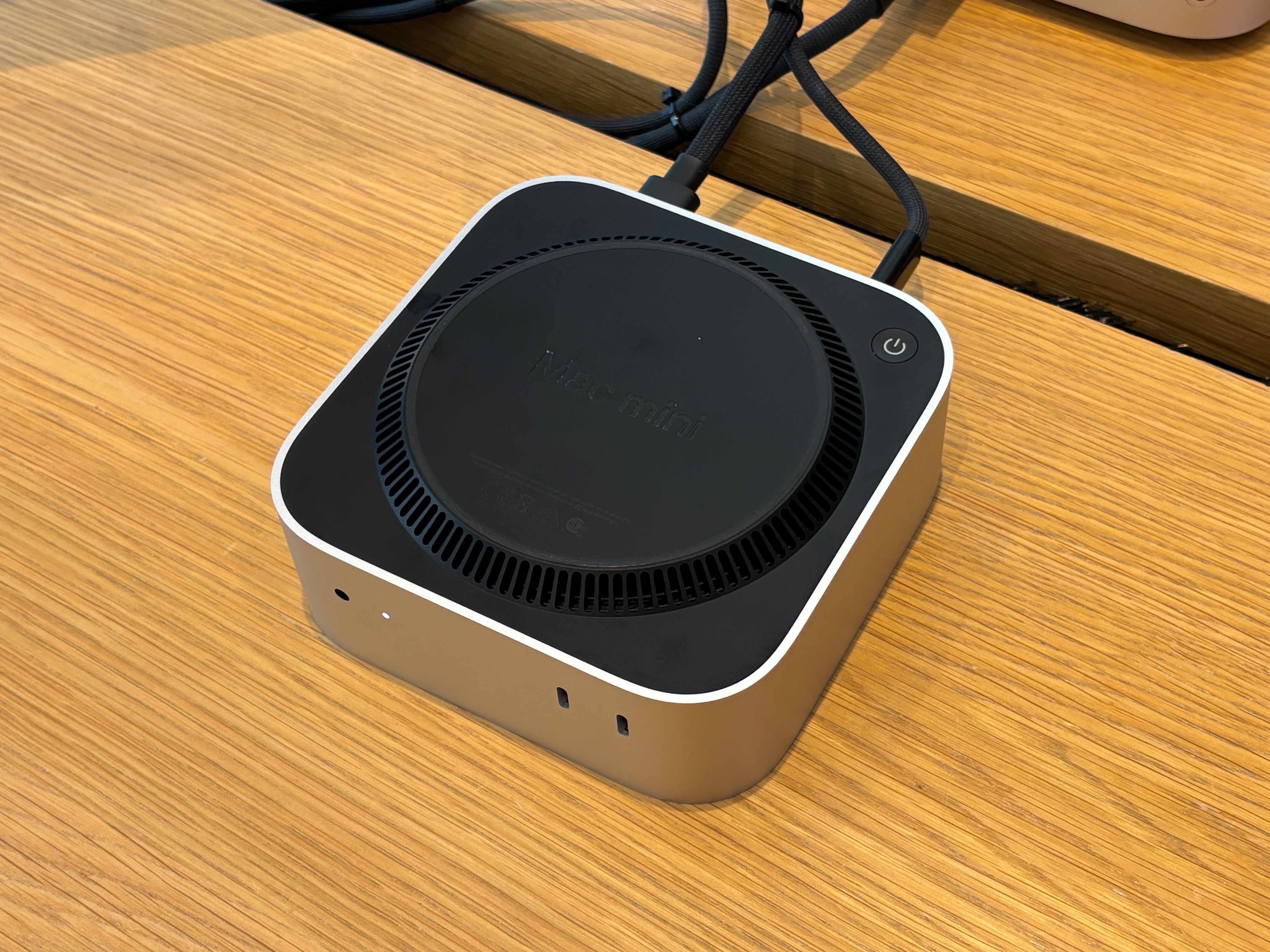
In a recent interview with a Chinese content creator on Bilibili, Apple VPs Greg Joswiak and John Ternus addressed this very question. According to a machine-translated report by ITHome, the executives explained that the primary reason for placing the power button on the bottom is the Mac mini's significantly reduced size. Joswiak mentioned that the underside was "kind of the optimal spot for a power button" due to the device being nearly half the size of its predecessor.
You pretty much never use the power button on your Mac.— Apple VP Greg Joswiak
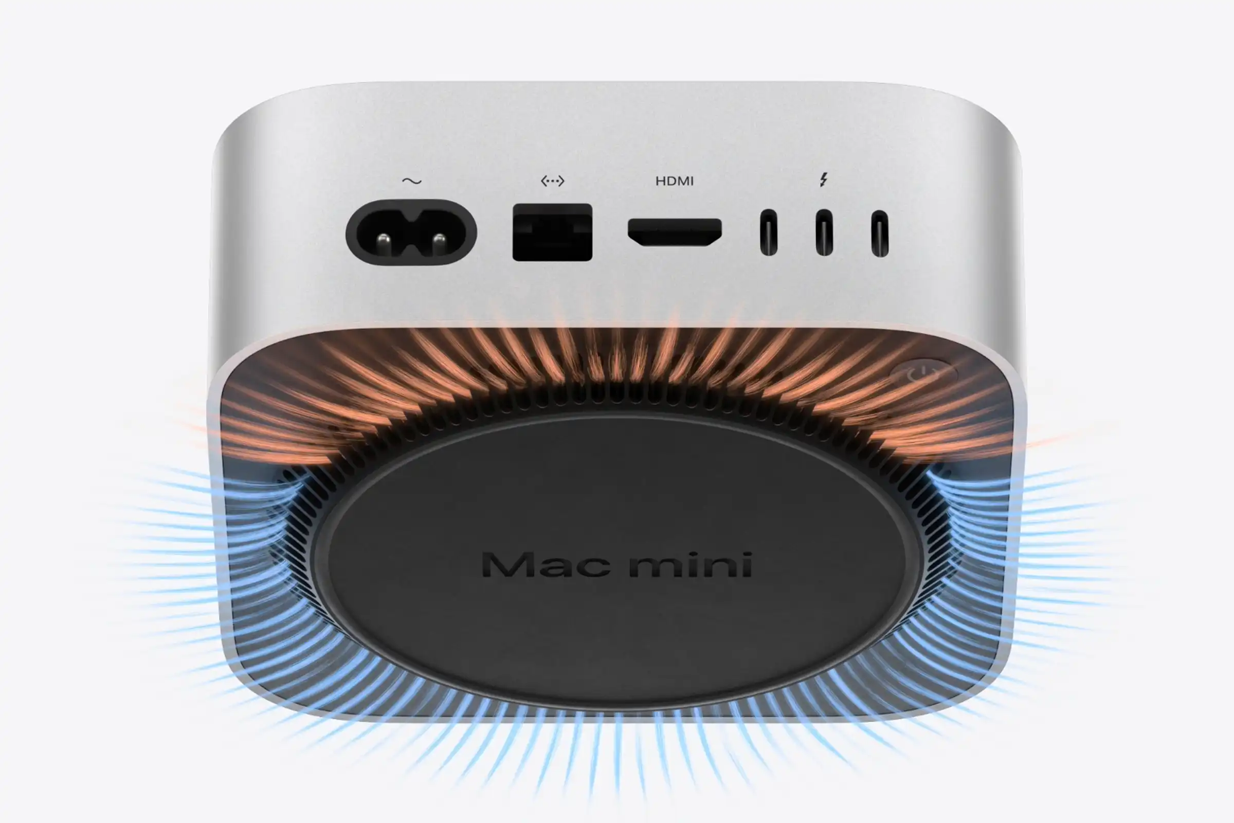
Joswiak suggests that most users keep their Macs in sleep mode rather than powering them off completely. Photo via Apple // Apple's new M4 Mac mini, showcasing the fan intake vents and power button located on the bottom of the mini computer.
The new Mac mini measures just 5 x 5 x 2 inches, a substantial reduction from the previous generation's 7.75 x 7.75 x 1.4 inches. This shrink in size undoubtedly contributes to its sleek appearance and the convenience of saving desk space. However, the placement of the power button means that to turn the device on, users have to reach around and slightly lift the unit—an awkward maneuver, especially if you're in a hurry. Will this be enough to make it onto our list of the top 10 most controversial Apple designs? Time will tell!
I can't help but feel that while the minimalist design is aesthetically pleasing, practicality has taken a backseat here. Personally, I like having easy access to the power button, even if I don't use it every day. It's one of those small conveniences that you don't appreciate until it's gone.
Despite this quirk, the Mac mini remains a powerhouse. The base model starts at $599 and boasts a 10-core CPU, 10-core GPU, 16GB of RAM, and 256GB of storage. There's also an M4 Pro configuration available starting at $1,399 for those needing even more performance. Photo via Mr. Macintosh // The bottom of Apple's new M4 Mac mini, displaying its power button which is now located on the bottom.
Apple has pointed out that essential ports like Thunderbolt 5 and HDMI are still easily accessible, which is certainly a relief. And let's be honest, the vast majority of us probably won't find the power button's location to be a deal-breaker. Some inventive users have even started mounting their Mac minis under their desks to make the power button more accessible.
At the end of the day, the M4 Mac mini offers incredible value and performance in a tiny package. While the power button placement might be a minor annoyance, it's a small price to pay for what you're getting. As someone who appreciates both form and function, I hope future iterations find a way to blend the two a bit more seamlessly.
Recommended by the editors:
Thank you for visiting Apple Scoop! As a dedicated independent news organization, we strive to deliver the latest updates and in-depth journalism on everything Apple. Have insights or thoughts to share? Drop a comment below—our team actively engages with and responds to our community. Return to the home page.Published to Apple Scoop on 11th November, 2024.
No password required
A confirmation request will be delivered to the email address you provide. Once confirmed, your comment will be published. It's as simple as two clicks.
Your email address will not be published publicly. Additionally, we will not send you marketing emails unless you opt-in.