The End of Skeuomorphism: How iOS 7 Changed UI Design
- Over a decade ago now, Apple ditched its famous realistic designs for a bold, minimalist look with iOS 7.
- Critics were stunned at first, but history proved that less really is more.
- Discover how the launch of iOS 7 sparked a design evolution that still resonates today.
Apple’s bold departure from skeuomorphic design in iOS 7 wasn’t just a visual overhaul—it redefined how we interact with our devices. Launched in 2013, iOS 7 swept away the textured, almost lifelike interfaces of its predecessors and replaced them with a cleaner, more abstract aesthetic that has influenced mobile design for over a decade.
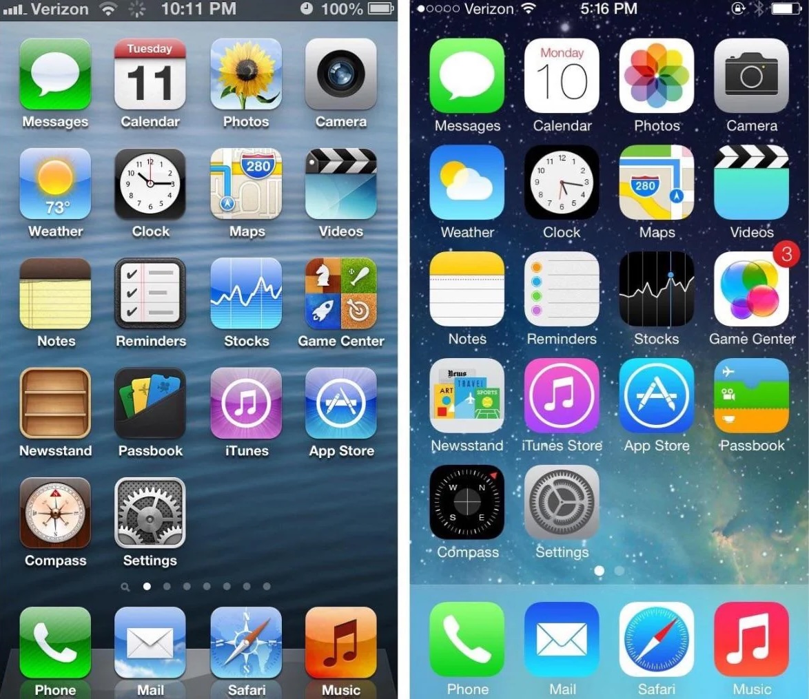 Photo via Reddit // Comparison: Apple's iOS 6 (left) vs. iOS 7 (right).
A Huge Design Shift
By the time iOS 7 hit the scene, many critics argued that Apple’s design language had grown stale. Gone were the notepad-like Notes app and the felt-inspired Game Center; instead, Apple opted for a design that celebrated clarity and simplicity. As Jony Ive put it during the launch:
I think there is a profound and enduring beauty in simplicity. In clarity. In efficiency. — Jony Ive, legendary Apple designer
This sentiment wasn’t just rhetoric. The move toward a flat, minimalist design signified Apple’s confidence that users had evolved—no longer needing the crutch of realistic metaphors to navigate digital interfaces.
iOS 7's Impact
Immediately noticeable were the dramatic changes:
- Brighter Home Screens: Redesigned app icons in vivid reds, greens, and blues transformed the look of the home screen.
- Translucency and Layering: The introduction of translucent elements created a sense of depth without relying on heavy textures.
- Simplified Typography: A switch to thinner fonts, initially Helvetica Neue Light, contributed to a sleeker interface, even if it meant sacrificing some legibility at first.
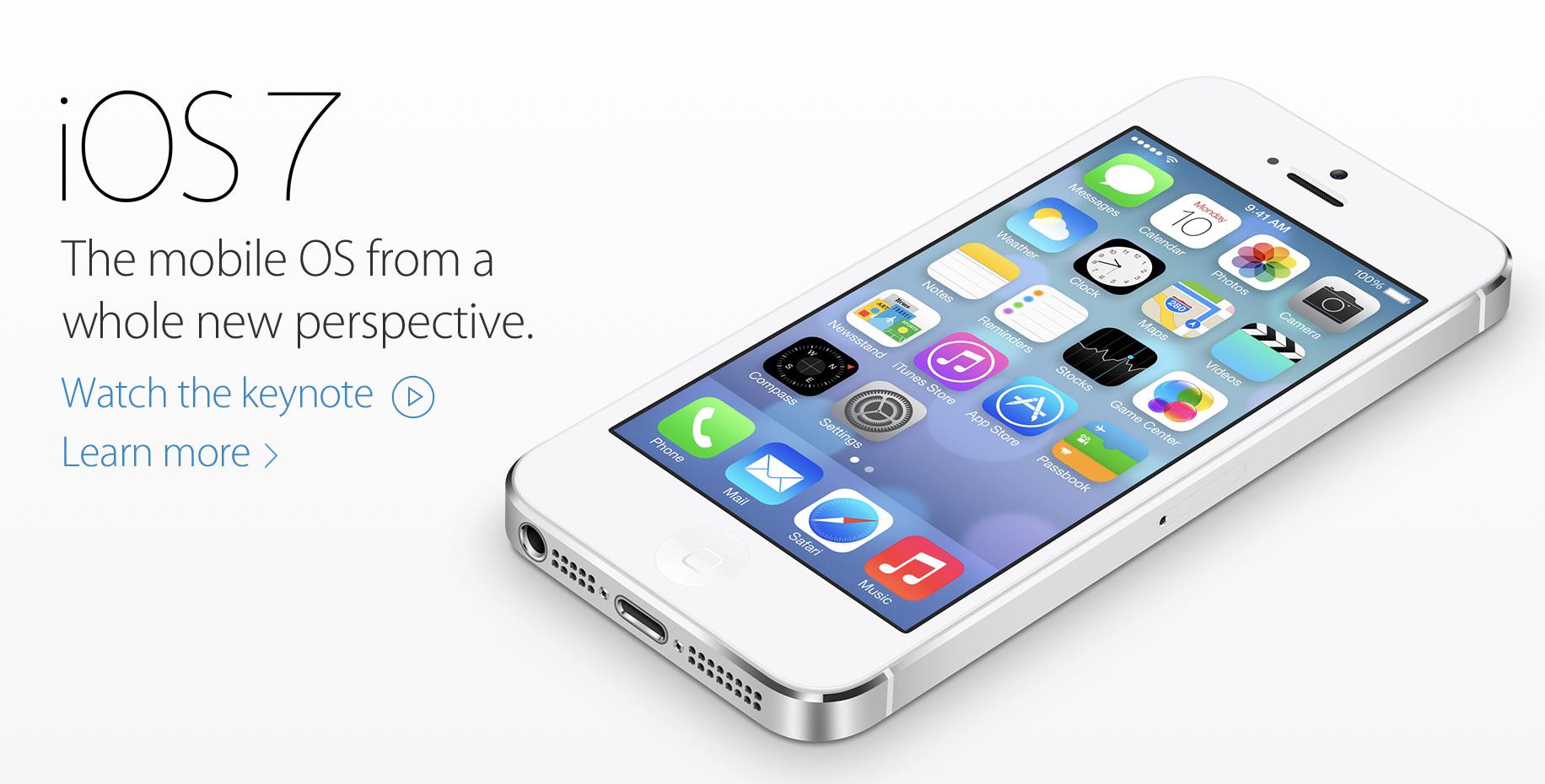 Photo via Apple // The Apple.com homepage on the day of iOS 7's launch in 2013.
Critics were vocal at launch. Joshua Topolsky of The Verge described the new design as “simply confusing,” and others quipped about the “puffed up” icons and odd new symbols like the “box with an arrow pointing up” for sharing. Yet, as time passed, these radical changes proved foundational. Within just five days, iOS 7 was installed on 200 million devices, and even early missteps—such as overly thin fonts and inconsistent iconography—were gradually refined. As design engineer Janum Trivedi noted, “A lot of the criticism around iOS 7 was very focused on its initial implementation... But that’s expected of any new design language—it takes time to bake.”
At the time, there was even media coverage about people getting physically sick after installing the iOS 7 update due to Apple's additional of a system-wide parallax effect meant to give the interface "depth" without the use of shadows or realistic UI elements.
Skeuomorphism
Before iOS 7, skeuomorphic design reigned supreme. This approach borrowed heavily from real-world textures and objects—think of the yellow notepad in Notes or the bookshelf style of Newsstand. While these designs helped users transition to digital interfaces, they eventually became a design crutch.
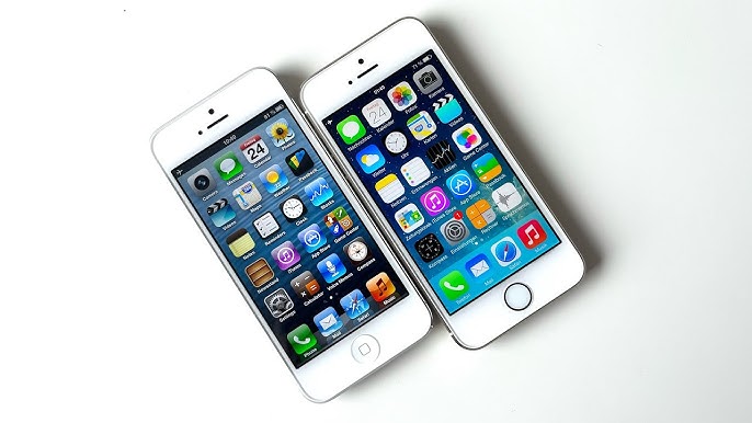 Photo via iOS Aesthetics, via YouTube // Comparison: Apple's iOS 6 (2012, left) and iOS 7 (2013, right).
By 2013, with smartphones now ubiquitous, Apple’s decision to strip away these elements was both risky and necessary.
The shift to a minimalist aesthetic was more than skin deep. It set the stage for interface elements we take for granted today—such as swipe gestures, airy layouts, and the refined use of white space. As one review put it, despite the initial shock, iOS 7’s visuals “don’t offer much change under the surface,” yet they became the silent engine powering modern iOS design.
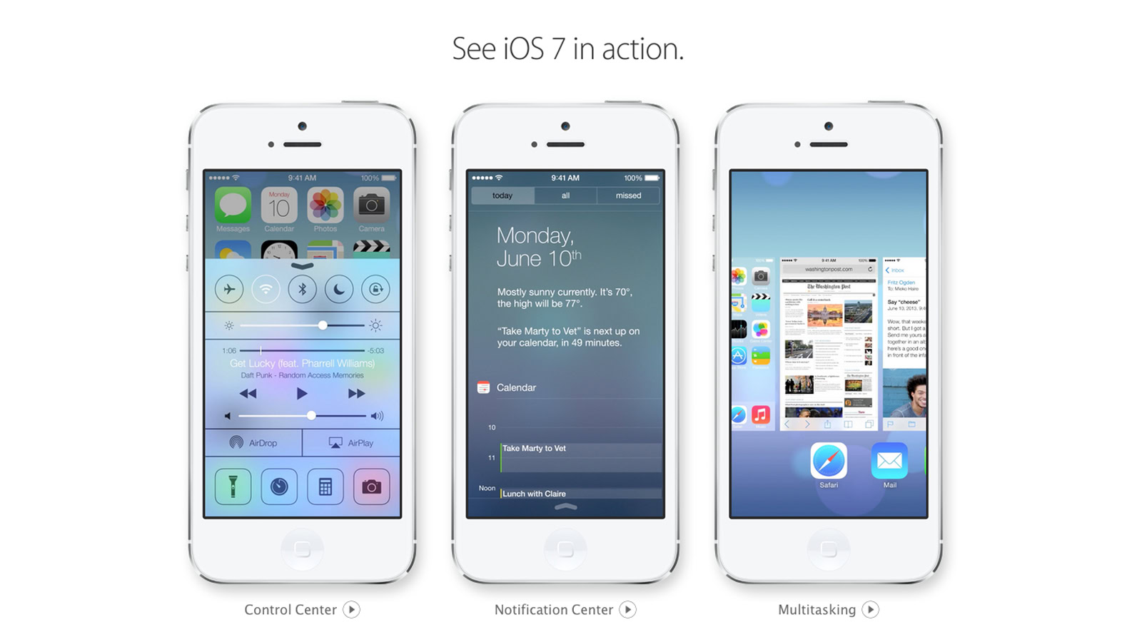 Photo via Apple.com // Much of the design language introduced with iOS 7 in 2013 still influences our software over a decade later in 2025.
Looking Forward
Fast forward to today, and the legacy of iOS 7 is evident in every subsequent update. Recent iterations have built on its principles, blending minimalism with subtle nods to skeuomorphism—a reminder of design’s cyclical nature. Rumors about iOS 19 suggest another potential redesign, one that might inject fresh energy into Apple’s interface while preserving the simplicity that has become its hallmark.
As users demand more personalization and dynamic control over their devices, Apple seems poised to experiment once again. While the core philosophy of “less is more” endures, there’s speculation that future versions might reintroduce select skeuomorphic cues in a modern context, blending the best of both worlds.
Final Thoughts
The transition from skeuomorphism to flat design with iOS 7 was more than a cosmetic update—it was a bold statement about the evolution of technology and user expectations. Ten years on, that decision continues to influence design trends, proving that sometimes stripping away the old can pave the way for enduring innovation.
Recommended by the editors:
- Free Wallpaper Download — 250+ Best Backgrounds
- Best 100+ Depth Effect Wallpapers & Backgrounds for iOS 26
- iPhone 17: 10 Hidden Features You Never Knew Existed
- Top iOS 26 Wallpapers & Backgrounds — Download Free
- Top 500+ Stock Wallpapers for iPhone, Android, Mac, PC, and iPad (Free 4K/HD)
Published to Apple Scoop on 18th March, 2025.