Explained: What Is Skeuomorphism?
- Remember those textured icons that felt like home? They're sneaking back into modern UI.
- Discover how the flat design revolution of iOS 7 left its mark on the entire industry.
- Dive into the design battle between minimalism and skeuomorphism—and why the old school is reemerging.
In the early days of digital interfaces, designers leaned heavily on skeuomorphism—a design approach where digital elements mimic the look and feel of their real-world counterparts. Today, the term might conjure images of those familiar, textured icons from classic apps like Notes or Newsstand, but its evolution tells a story of both innovation and adaptation in the tech industry.
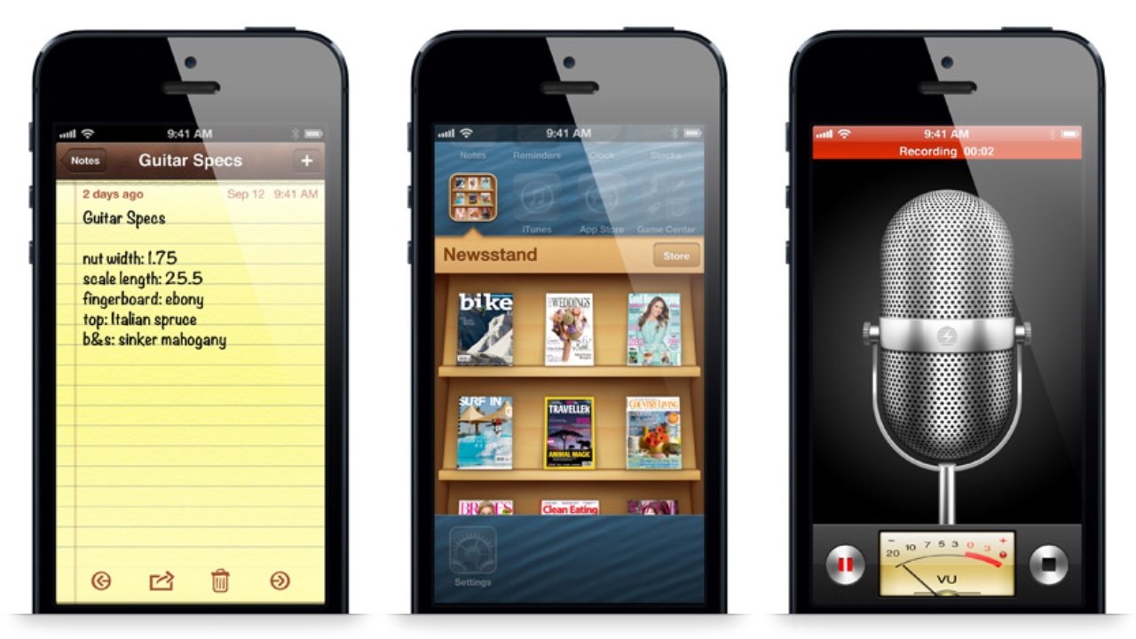 Photo via AppleInsider Forums // An iPhone 5 running iOS 6 showcases Apple's Notes app, Newsstand app and Voice Memos app pre-iOS 7's huge design shifts.
Defining Skeuomorphism
Skeuomorphism is all about borrowing elements from the physical world to create intuitive digital experiences. Early graphical user interfaces, like those seen on the original Macintosh, used metaphors such as the desktop, trash can, and even buttons that appeared raised with shadows to signal their interactivity. These design cues helped users transition from the analog to the digital by offering a familiar visual language.
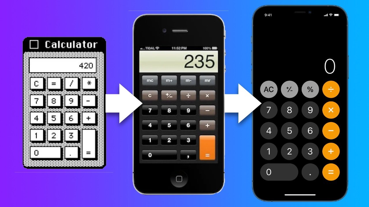 Photo via AppleInsider // Skeuomorphism was a major part of Apple's design philosophy for a very long time.
“Skeuomorphism is used when a designer carries over elements from an original object into a new one,” explains a piece on UX design, emphasizing how this approach wasn’t just about aesthetics—it was about usability and comfort for users stepping into an entirely new medium.
The Rise and Fall of Skeuomorphic Design
During the early years of smartphones, skeuomorphic design reigned supreme. It lent apps a tactile, almost tangible quality: the yellow notepad background in the Notes app, the bookshelf-like interface of Newsstand, and even the textured dials of various utility apps. Such designs made digital tools approachable to a generation still acclimating to touchscreen technology.
However, as technology evolved, so did user expectations. By 2013, many critics and designers argued that these design elements had grown outdated, cluttering interfaces rather than clarifying them. Enter Apple's iOS 7—a watershed moment when Apple boldly shifted away from skeuomorphism. The operating system’s embrace of flat design, with its clean lines, airy white spaces, and translucent layers, signaled a new era in digital aesthetics.
Iconic designer Jony Ive captured the essence of that transformation when he stated:
I think there is a profound and enduring beauty in simplicity. In clarity. In efficiency.— Jony Ive during the launch of Apple's iOS 7
This pivot not only modernized Apple’s products but also influenced a broader industry shift towards minimalist UI design.
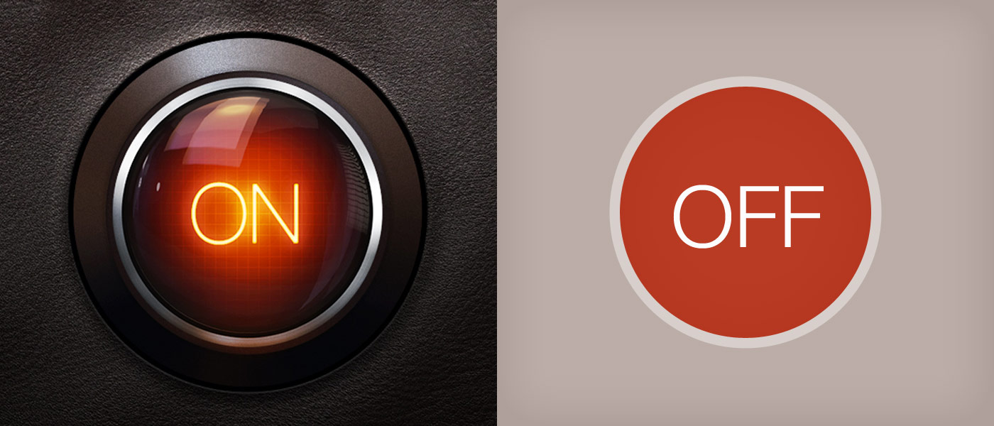 Photo via Web Design Blog via Wordpress // iOS 7 accelerated a trend that was already underway: the "flattening out" of just about every UI we use.
Why Did Skeuomorphism Drift Out of Favor?
The transition away from skeuomorphism was driven by several factors:
- Over-Reliance on Realism: As users became more familiar with digital interfaces, the need for literal visual metaphors diminished.
- Clutter vs. Clarity: Realistic textures and detailed icons often made interfaces feel busy, whereas minimalist designs emphasize clarity and ease of navigation.
- Scalability: Flat designs are easier to adapt across various devices and screen sizes, a crucial advantage in today’s multi-device landscape.
Critics of the skeuomorphic approach argued that while it initially eased users into new digital paradigms, it eventually became a crutch that hindered further innovation in interface design.
The Modern Comeback
Interestingly, the pendulum of design is swinging back. Today’s designers are rediscovering the value of subtle skeuomorphic cues—integrating hints of depth and texture into otherwise flat designs.
For example, modern material design in Android and refined UI elements in iOS 16 and beyond now incorporate nuanced shadows, gradients, and even hints of texture to enhance user engagement. This balanced approach provides the best of both worlds: the clean, efficient lines of minimalism with the familiar, human touch of skeuomorphism.
 Photo via Figma // Apple Vision Pro, Apple's virtual reality headset, introduced a new UI aesthetic to the masses, blending elements of skeuomorphism with elements of modern UI design.
iOS 7’s Lasting Impact
The design revolution sparked by iOS 7 wasn’t just an Apple story—it set a new benchmark for the entire tech industry. By stripping away the excess and focusing on intuitive, user-centric design, Apple not only reinvented its own interface but also influenced global design trends. Today’s UIs, regardless of the platform, owe a debt to that radical shift toward minimalism and clarity.
As rumors swirl around potential redesigns in upcoming systems like iOS 19, the conversation continues about how best to blend the clean simplicity of flat design with the engaging touch of skeuomorphic elements. This dialogue highlights an essential truth: design is not static but an evolving dialogue between technology and human interaction.
Final Thoughts
Skeuomorphism may have faded from the limelight with the advent of iOS 7, but its legacy is far from dead. The design principles it championed—familiarity, intuitiveness, and the bridging of digital with physical—still underpin today’s user interfaces. As designers experiment with a hybrid approach, we’re witnessing a renaissance where the lessons of the past inform the innovations of the future.
Recommended by the editors:
- No More September iPhones? Apple's Strategy Shift Changes Everything
- MacBook Pro M6 OLED Rumors: Release Date, Price, Features, and More
- 2026’s Top 250+ Wallpapers: The Ultimate Collection for iPhone, Android & More
- iPhone 18 Rumors: Apple Reportedly Testing Under Display Face ID
- Intel Could Finally Return to Apple Computers in 2027
Published to Apple Scoop on 18th March, 2025.
Just stumbled on your site. You have interesting articles - different, well written. Thnx for your time & talent ~CompSci Educator~
1 year ago