Redesigning the iOS Control Center
- The current design was introduced with iOS 11 and has only had minor updates ever since
- Our concept aims to make the design more inclusive and customisable while being touch-friendly and fitting on an iPhone
Apple redesigned the Control Center on the iPhone and iPad in 2017, with the introduction of iOS 11. This new design has existed ever since, and uses a grid layout with limited user customisation, but simple touch controls and clear information.
It was previously rumoured that iOS 14 and iOS 15 would come with a redesigned Control Center, potentially one that looks similar to the macOS Big Sur equivalent, however, these rumors haven’t come to light. While there is nothing particularly wrong about the current design, a refresh could bring a more logical layout and much-requested customisation.
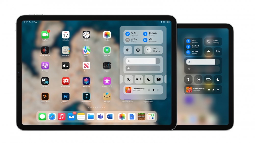
We’ve designed this concept without a major overhaul in mind. It takes inspiration from macOS, with a more detailed connections palette, which displays status information about WiFi, AirDrop and Bluetooth. To enable the design to remain friendly to users, the grid layout is used, but groups together similar toggles.
 Brightness and Volume sliders are grouped, as are quick device actions, such as Flashlight and Low Power Mode. The music player is also smaller, but as you can currently, force holding on these actions brings up a detailed view.
This screen is customisable too and currently, you can add and removed pre-specified toggles, but the layout of other controls remains the same. Similar to how widgets can be moved (“wiggle mode”), controls should be movable to create a layout of your liking.
A simple redesign like this, with the addition of date and time (by relocating battery percentage to the status bar) creates a fresh but approachable look and addresses some of the biggest concerns that users have had for years.
On iPad, the Control Center is simply a copy of the iPhone user interface and with no adaptable UI, it feels out of place and inaccessible, taking up the whole screen for only a few controls. Small tweaks to migrate the redesigned UI to iPadOS provided a few options.
 First – keep it the same. Copy the UI from the smaller screen and slightly adapt it to use more of the screen real-estate. In this view, it takes up the whole screen and is a barrier to multitasking. It simply doesn’t work.
The second approach is similar to – but not the same as – macOS Big Sur. Touch friendly controls appear in a pull down view, with a similar layout to the redesigned iPhone version. The larger screen allows for more detail, like more connection statuses at the top.
While, like the iPhone UI, this can be customised, preset and custom toggles are accessible in the row above the music player. When adding a toggle, it will appear on that row, ensuring that the Control Center doesn’t take up too much room. Simply swiping left or right will display the row of toggles.
Of course there is still room for improvement, but the redesign explores how Apple could change the Control Center to suit its pro-focused users on iPad, and ensure it stays as the part of the UI to go to change settings quickly on iPhone.
Recommended by the editors:
Thank you for visiting Apple Scoop! As a dedicated independent news organization, we strive to deliver the latest updates and in-depth journalism on everything Apple. Have insights or thoughts to share? Drop a comment below—our team actively engages with and responds to our community. Return to the home page.Published to Apple Scoop on 17th August, 2021.
No password required
A confirmation request will be delivered to the email address you provide. Once confirmed, your comment will be published. It's as simple as two clicks.
Your email address will not be published publicly. Additionally, we will not send you marketing emails unless you opt-in.