The History of Apple's Iconic Logo (1976 to 2024)
- Apple struggled to survive in the computing industry until Steve Jobs returned and revamped the company's branding.
- Apple's logo has undergone significant transformations over the years, with the most iconic design being a 2D apple with a bite taken out of it.
- Steve Jobs returned to Apple in 1998 and revamped the company's entire brand image, including the logo.
- Today, Apple is one of the world's most valuable and recognizable brands, with branding present in nearly every aspect of their business.
- This article explores Apple's logo transformation from its founding in 1976 to the present day.
Apple is one of the most valuable companies in the world, but it wasn't always this way. Initially, Apple struggled to survive the cutthroat industry of computing, and at one point, they were thought to be doomed until Steve Jobs made a miraculous return and revamped the company. A significant part of their success lies in their incredible branding, starting with their logo.
In this article, we will take a look at how Apple's logo transformed throughout the years into one of the world's most iconic symbols. But first, let's delve into some Apple facts. Initially, Apple was founded by Steve Jobs, Steve Wozniak, and Ronald Wayne. Wayne quit after only 12 days and sold his share of the company for $800. Today, his shares are worth $60 billion! Apple was so short of cash at the beginning that Jobs and Wozniak sold their Volkswagen van and a scientific calculator to raise enough money to buy parts for their first order.
The popular Macintosh computer got its name from the McIntosh apple, keeping the apple theme through and through. Like we said earlier, Apple is one of the biggest and most popular brands in the world, but it wasn't always that way. Apple started in a small Californian garage in 1976, and it took years for Apple to gain popularity, which helped increase customer loyalty and brand awareness. Their branding is in nearly every aspect of their business, from their retail stores' design and layout to the beautiful unboxing experience that comes with every new product purchase. Their most iconic branding feature is their logo.
Now, let's explore the evolution of Apple's logo from 1976 to the present day.
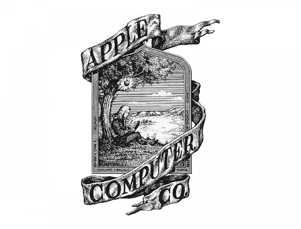
 Image credit: Apple Inc. 1976 logo.
1976
The first Apple logo was created by Ronald Wayne, who decided to use Isaac Newton's image sitting below a tree.
 Image credit: Apple Inc. 1977 logo.
1977
After only a year, Steve Jobs hired Rob Janoff to create a logo that would blend the name "Apple" with a modern-looking design. Janoff's design was quite simple, a 2D apple with a bite taken out of it and a rainbow spectrum splashed across it.
 Image credit: Apple Inc. 1984 logo.
1984
The same year the Macintosh was launched, Landor Associates removed the company's name from the logo, turning it into the iconic symbol that would represent the brand for decades to come.
 Image credit: Apple Inc. 1998 logo.
1998
Steve Jobs returned to Apple and revamped the company's entire brand image. He removed the rainbow colors and replaced them with solid black, to give the logo a more sophisticated look that would appeal to a wider range of customers.
In conclusion, Apple's logo has undergone significant transformations throughout the years. The company has come a long way since its beginnings in a small Californian garage in 1976. Today, Apple is one of the biggest and most popular brands in the world, with branding that is present in nearly every aspect of their business, from their retail stores' design and layout to the beautiful unboxing experience that comes with every new product purchase.
Recommended by the editors:
Thank you for visiting Apple Scoop! As a dedicated independent news organization, we strive to deliver the latest updates and in-depth journalism on everything Apple. Have insights or thoughts to share? Drop a comment below—our team actively engages with and responds to our community. Return to the home page.Published to Apple Scoop on 13th March, 2023.
No password required
A confirmation request will be delivered to the email address you provide. Once confirmed, your comment will be published. It's as simple as two clicks.
Your email address will not be published publicly. Additionally, we will not send you marketing emails unless you opt-in.