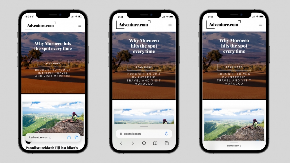
How Apple can improve Safari in iOS 15
- The controversial new Safari design moves the address bar to the bottom of the display.
- It's led to ways in how Apple can improve the experience before publicly launching it this fall.
In iOS 15, Apple redesigned Safari with a focus on one-handed use, shifting the address bar to the bottom of the screen. The new design is a big move from the previous user interface, which has remained largely the same since the introduction of iOS 7.
The adaptable address bar ditches the bottom row of functions in favour of a menu-based system where common functions, like refreshing, downloads, sharing and other actions are located. You can also switch between tabs by swiping left and right on the address bar, and quickly carry out a search at the tap of a button.
 However, Apple has come under intense pressure from beta testers to change the UI again, and revert to the previous design. Users have described the experience as hard to use and impractical, with the once easy to use options now buried in menus. This is mainly due to the number of touch points in the area at the bottom of the screen – in iOS 15 beta 4, there are 7, consisting of the navigation icons, address bar spaces, share icon, tabs icon and badly placed refresh icon.
The company is now responding to feedback and has continued to evolve the design in iOS 15 beta 4. With the latest iPadOS 15 beta, it even brought back the ‘classic’ tab UI and made the new design optional. However, it still has work to do in improving the UI on iPhone.
 To address this, Apple shouldn’t return to the old design completely. A one-handed approach makes sense for ease of use, especially as iPhone models continue to get larger. As laid out in this concept by Apple Scoop, an improved UI should consist of the current address bar design, but focus on actions commonly used, and reduce the reliance on the awkward collapsible UI elements.
While it could still obscure content, the jittery animations and movement logic have been replaced with a user-collapsable palette with a simplified address bar (two touch points, including the refresh button). Navigation underneath this UI reduces clutter and sits near options for history, tabs and the more menu.
Dragging this upwards could reveal any open tabs in the same ‘palette’, or alternatively, open the ‘more’ menu, revealing options for Reader View, Privacy Report, downloaded files and the same share options as currently.
When scrolling, the UI collapses to allow the user to focus on their content, but will reveal itself again after moving up the page, or using the same modal view.
Recommended by the editors:
Thank you for visiting Apple Scoop! As a dedicated independent news organization, we strive to deliver the latest updates and in-depth journalism on everything Apple. Have insights or thoughts to share? Drop a comment below—our team actively engages with and responds to our community. Return to the home page.Published to Apple Scoop on 1st August, 2021.
No password required
A confirmation request will be delivered to the email address you provide. Once confirmed, your comment will be published. It's as simple as two clicks.
Your email address will not be published publicly. Additionally, we will not send you marketing emails unless you opt-in.